eNetAuthor designing for multiple devices
With mobile learning now in the top 10 of learning methods , training teams have even more to consider in eLearning design.
Multi-platform eLearning can greatly enhance engagement, by giving learners more options in accessing materials. But how can you ensure that your designs work equally well across different devices?
eNetAuthor creates fully responsive eLearning from source, allowing you to develop one version of your eLearning course which works across multiple platforms and devices.
Responsive design responds to the device being used. Content is repositioned and resized in a specific order to best fit the device screen and ensure an optimal learning experience.
All features within eNetAuthor are built to be responsive. Content is housed in a container which holds the core functionality of the course. The container relays information to and from your learning management system, so all functionality works on any device.
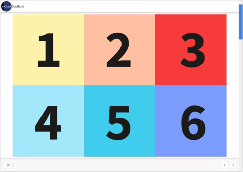
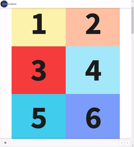
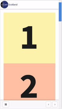
To suit your design requirements, eNetAuthor offers a number of layouts, 1 full width cell, 2 columns and 3 columns. The diagram below shows how content is repositioned for different devices. When using the 1 and 2 column grid, objects and text are resized to fit the device screen.
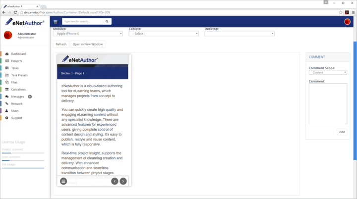
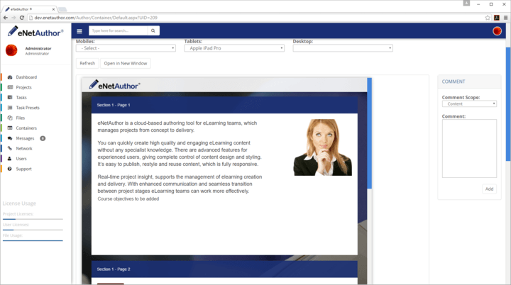
In eNetAuthor you can preview content on a range of devices throughout the design process, allowing you to adapt the design to get the best possible format for multi-platform learning. As you can see below, the option to view content on multiple devices is along the top bar, you can view the final version on a specific device by choosing from the mobile, tablet and desktop options.
Try eNetAuthor for yourself by registering for your free 30 day trial at enetauthor.com/Register
Other Blogs

4 Collaborative Authoring Problems Solved With eNetAuthor
Discover how eNetAuthor features can help solve 4 collaborative authoring challenges.
Read More
Key Content Creation Tools For Designers
eNetAuthor has a range of features to help designers quickly get started with online course creation.
Read More
eNetAuthor at World Of Learning 2016
eNetAuthor are very pleased to be attending the World Of Learning Conference 2016 on Wednesday 19th and Thursday 20th October.
Read More
5 Ways eNetAuthor Can Help With Storyboarding
To make any piece of content effective, from a simple letter to a multipage slide presentation, it is essential to structure the content. eLearning is no different.
Read More
How to Use Graphics in eLearning
When creating an eLearning course it is important to consider the best use of graphics in the course.
Read More
How Cloud Authoring Can Help You Move To eLearning
For teams who have to deliver a large number of eLearning projects in a short time-scale eNetAuthor’s cloud authoring helps to streamline the development process in a number of ways.
Read More
Supporting Content Development Teams
Many eLearning authoring tools are designed for individuals and as teams grow the tools don’t fulfil their needs. eNetAuthor has been designed and built to support content development teams.
Read More
Getting Started With Instructional Design
Applying robust instructional design to eLearning development will ensure the content is effective and engaging for learners.
Read More
eNetAuthor designing for multiple devices
With mobile learning now in the top 10 of learning methods, training teams have even more to consider in eLearning design.
Read More
Webinar: Introducing eNetAuthor
Learners now expect to be able to access learning wherever they want and on their choice of device, making responsive/adaptive eLearning authoring a priority for many training teams.
Read More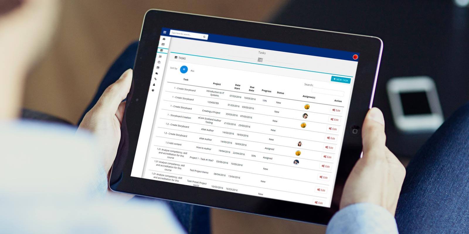
Learning Analytics using eXperience API (xAPI)
Even the sound of xAPI scares some eLearning content designers with many still getting over all the hype about SCORM (Sharable Content Object Reference Model).
Read More
Webinar: Cloud Authoring - from storyboard to eLearning in eNetAuthor
With numerous contributors to your elearning project (from subject matter experts to instructional designers to reviewers) gathering information from all in a timely and usable manner can be difficult and can be the cause of a potential bottleneck in your learning development project.
Read More